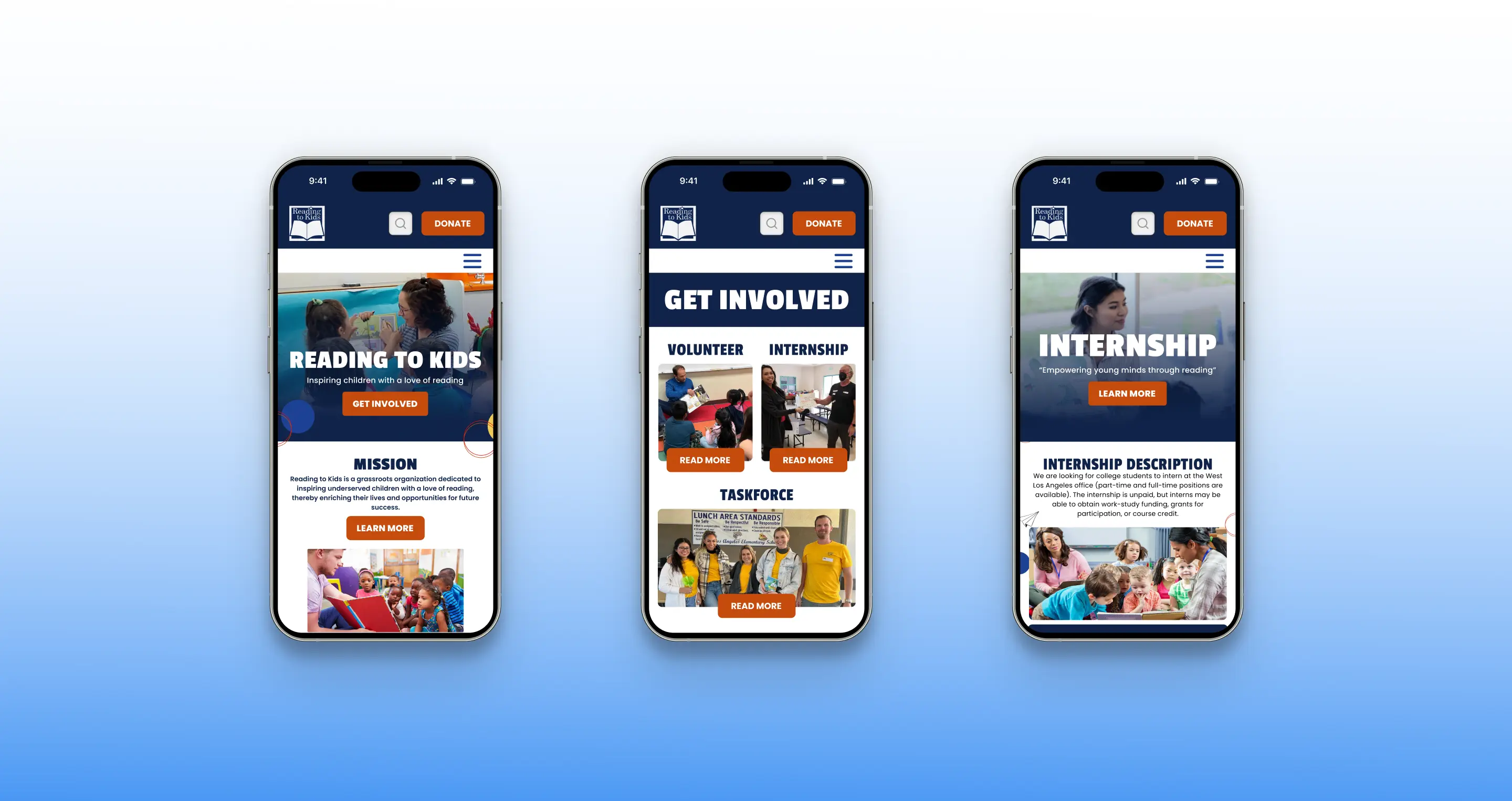
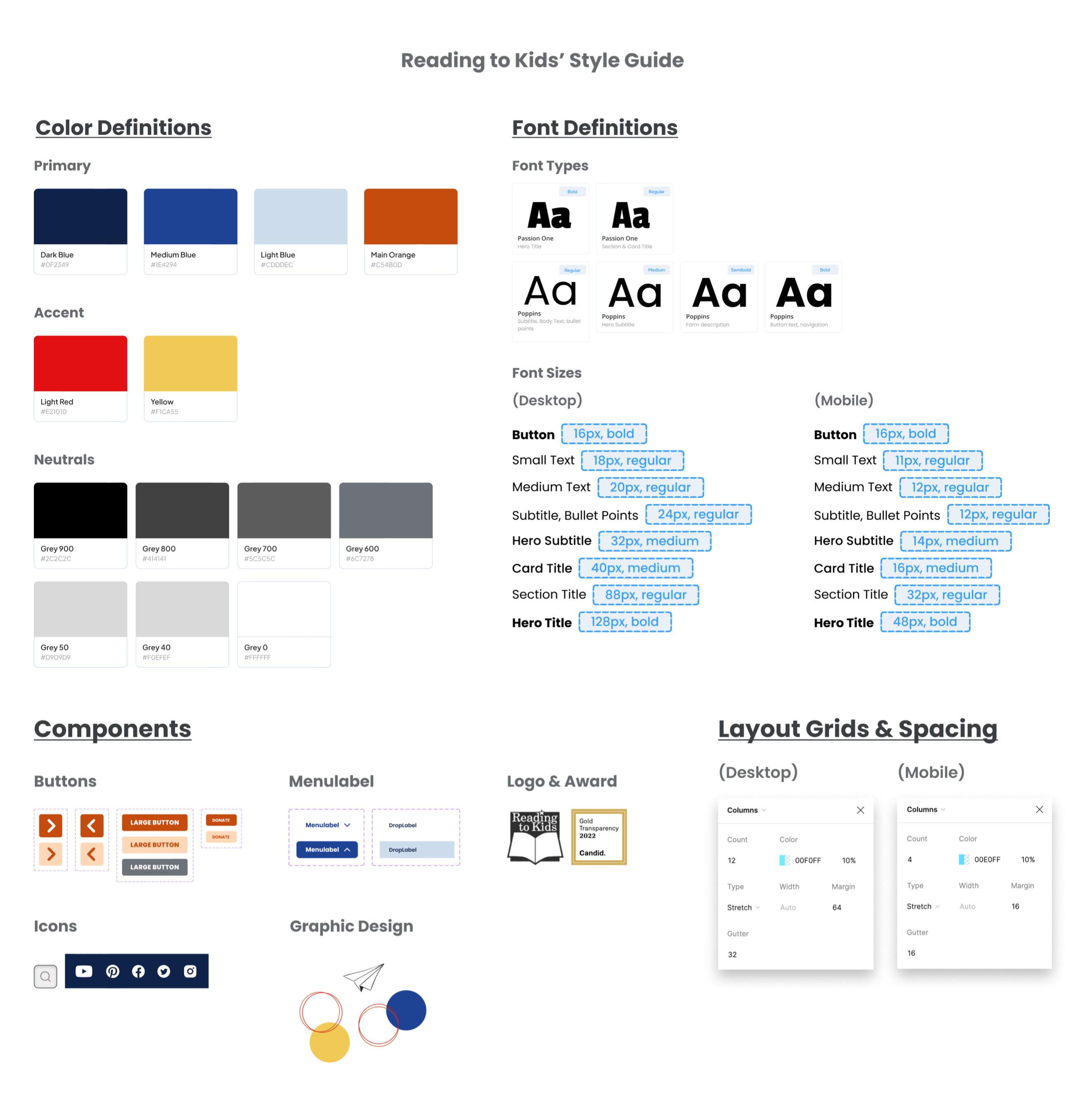
1. Prototyped the entire website redesigned (desktop & mobile).
2. Designed high-fidelity screens and sketched wireframes (homepage & Internship page).
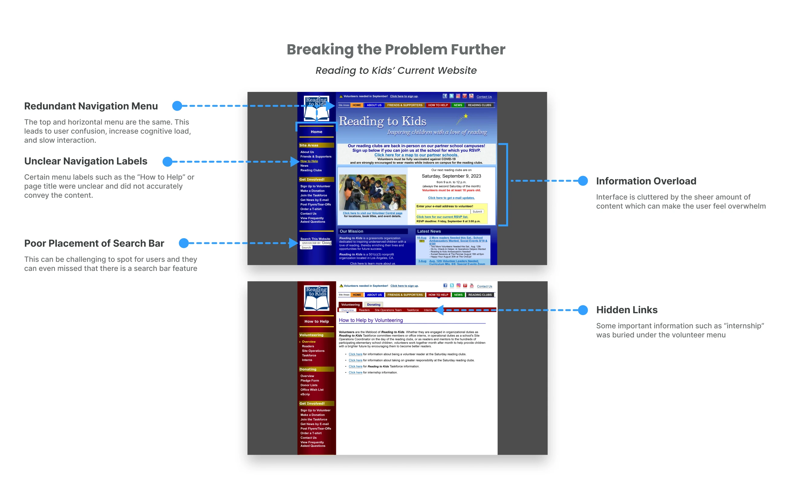
3. Evaluated usability challenges of the current site.
4. Reorganized the information architecture.
5. Identified design trends & industry standards through competitor analysis.
Design Process
Empathize
• Usability Evaluation
• User Test
Define
• User Persona
• How can we statement
• Design Principles
Ideate
• Competitor Analysis
• Sitemap
• Wireframes
• Brand Exploration
Prototype
• Desktop & Mobile
Defining the Problem
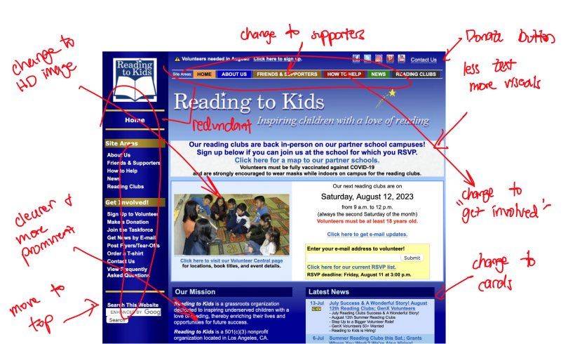
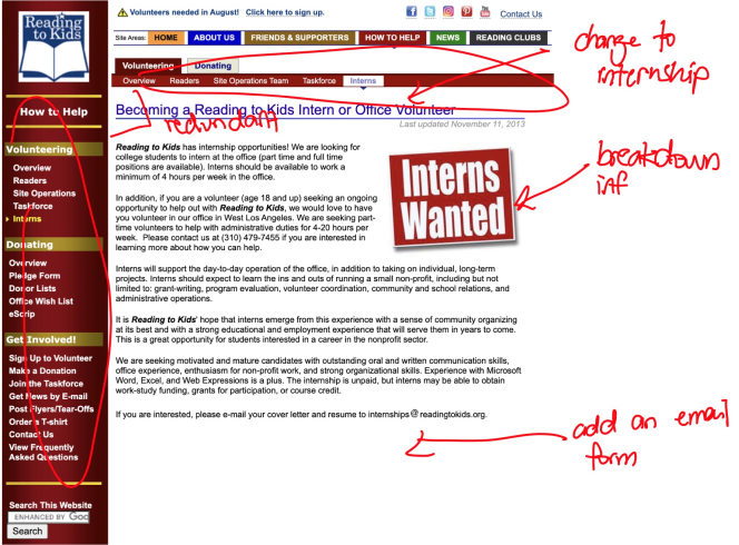
First, we assessed the current website to quickly identify the usability issues. We found that the two main usability challenges are: confusing navigation and cluttered interface.
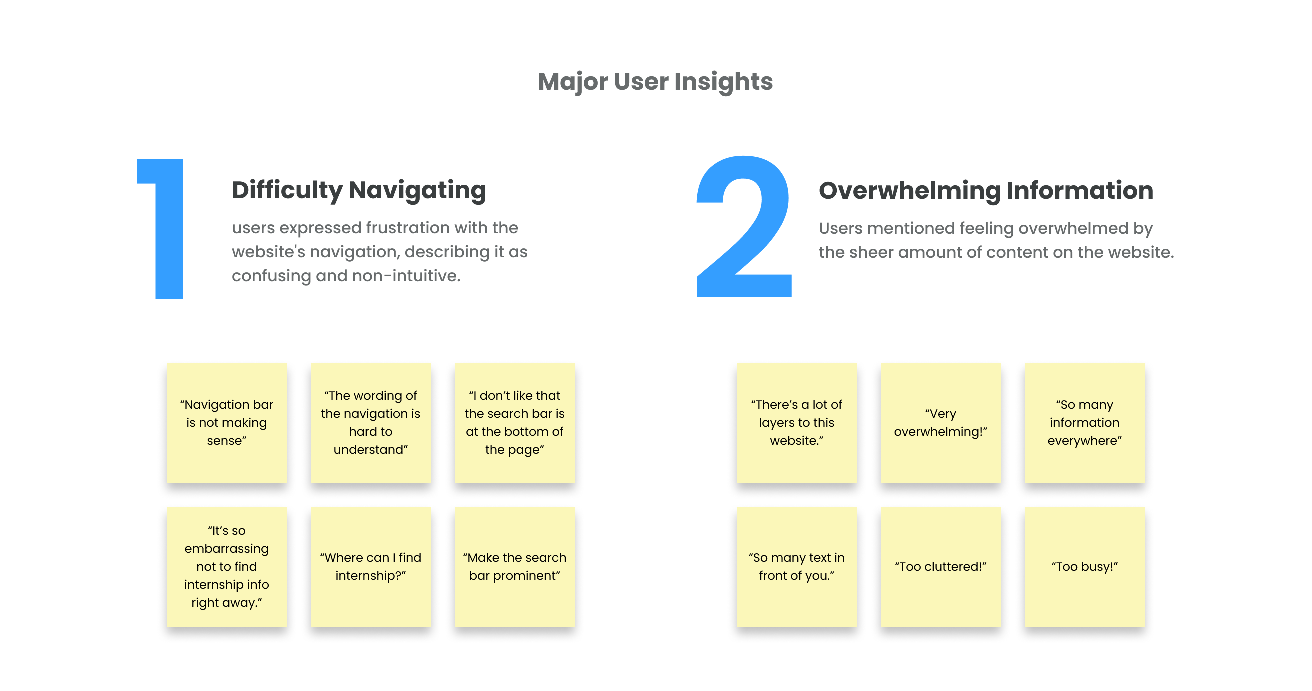
Identifying User Pain Points
We conducted usability tests to further understand user pain points to ensure that the new design will effectively solve the identified issues.
Key Research Questions:
1. Can you easily determine how to get involved or sign up for volunteer or internship opportunities?
2. How would you describe your overall experience navigating the current website?
3. Based on your experience with the current website, what improvements or changes would you suggest to enhance the user experience?
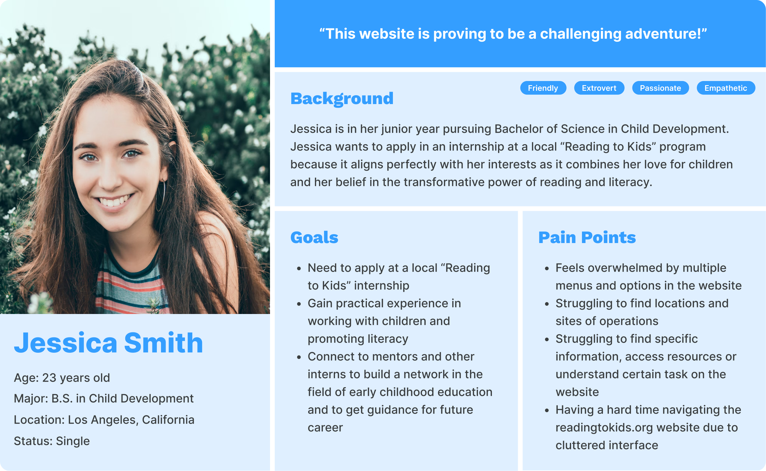
Contextualizing the Target User
Our target user in this project are aspiring interns in the Reading to Kids Program. A journey map was also created to show the challenges that users face when applying as an intern.
Design Challenge
How can we help users navigate effortlessly and find relevant information quickly to empower users to understand opportunities and take purposeful actions?
Addressing the Design Challenge
We established design principles that will guide the new design to address the design challenge.
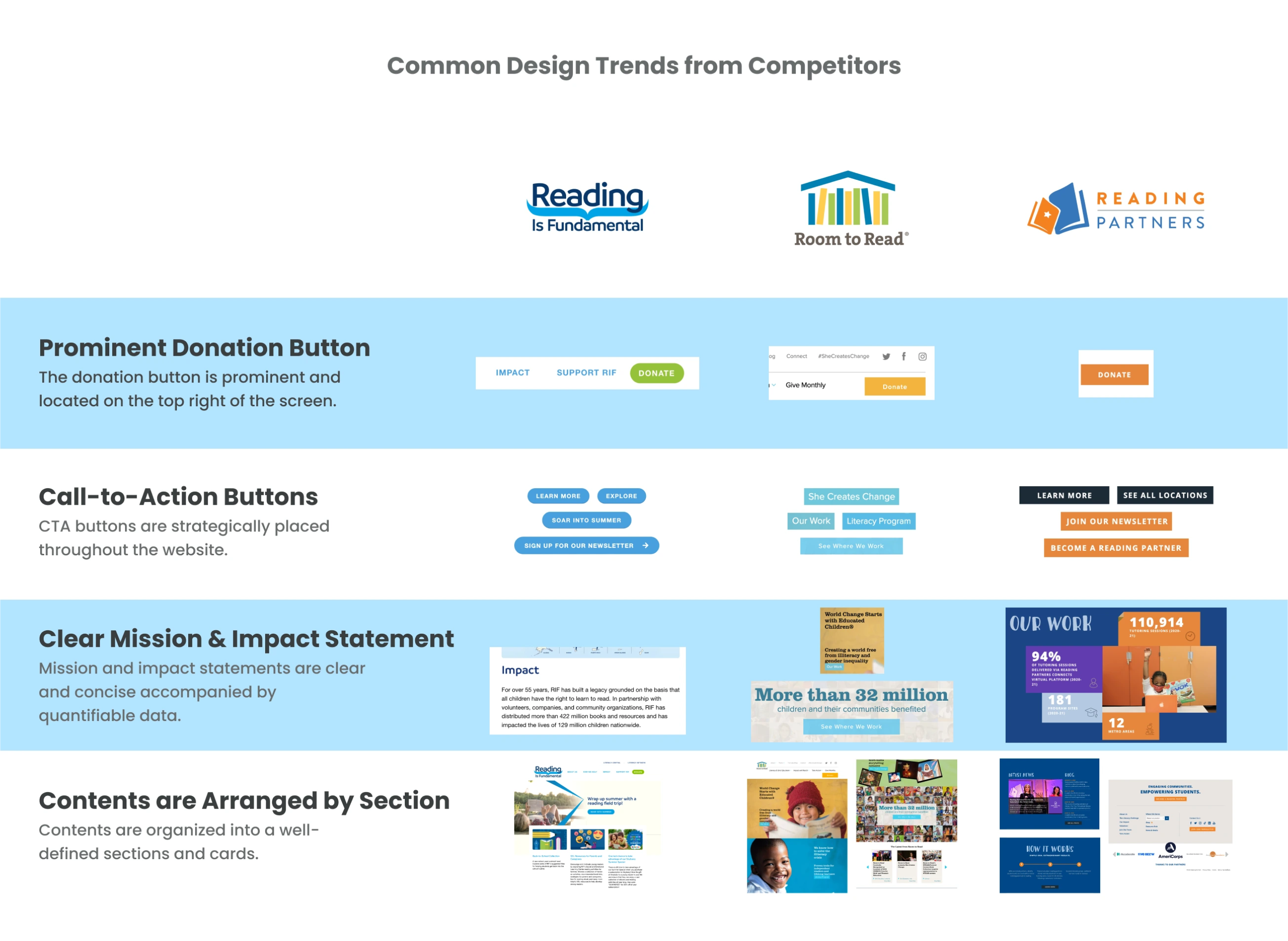
Analyzing the Competitors’ Design Trends
We wanted to look at competitors to help ensure that the new design aligns with current design trends, user preferences, and industry standards, enhancing the website's visual appeal and user experience.
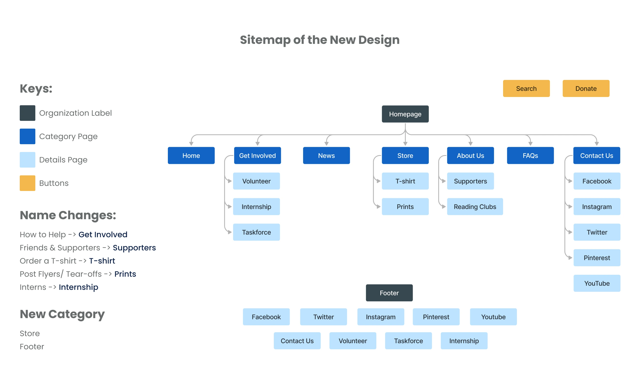
Reorganizing the Navigation System
During the sitemapping, we organized related links into logical groups and refined labels to create a more user-friendly and intuitive navigation experience.
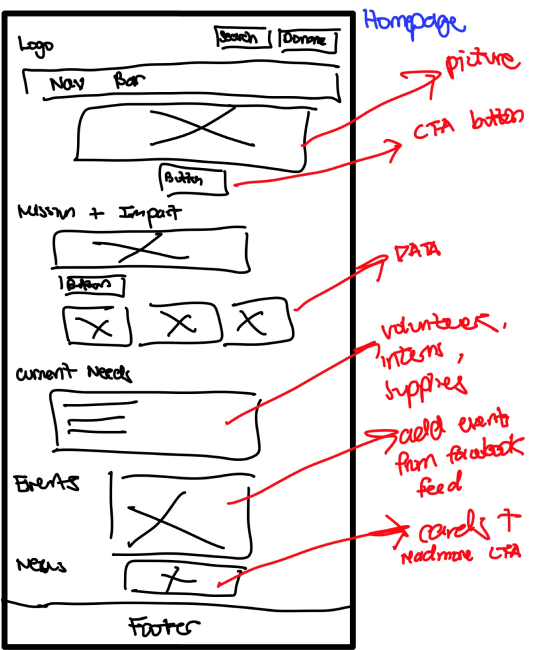
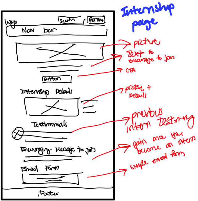
Sketching Redesign Concepts
I sketched out sections of the website and annotated the current site, highlighting modifications, deletions, and additions to visualize the redesigned website.
Wireframes (Homepage & Internship Page)
Annotations on the Current Site
Video of me sketching the wireframes
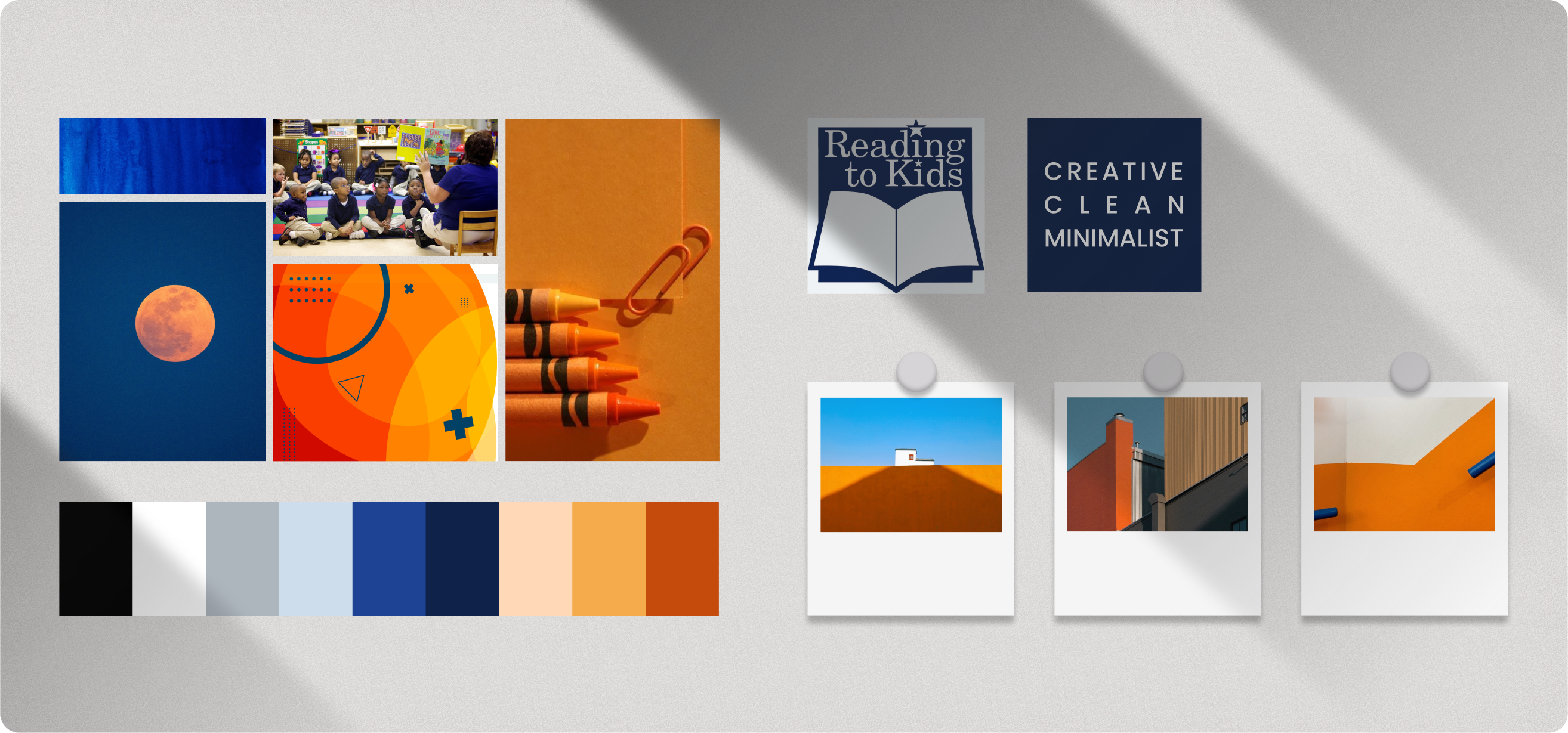
Exploring a Modern Branding
Before starting the high-fidelity prototype, we created a moodboard to establish a visual direction and style of the project.
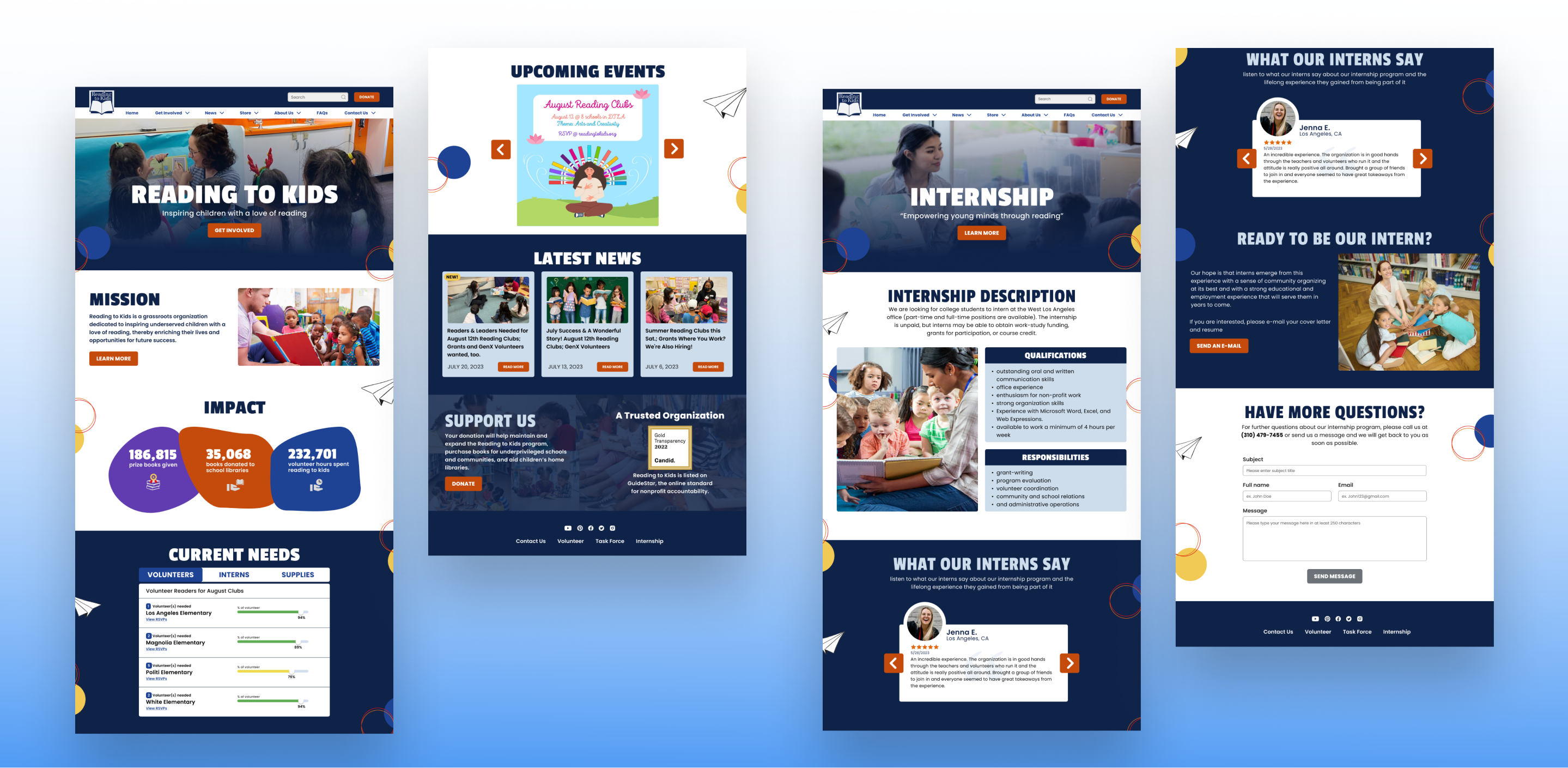
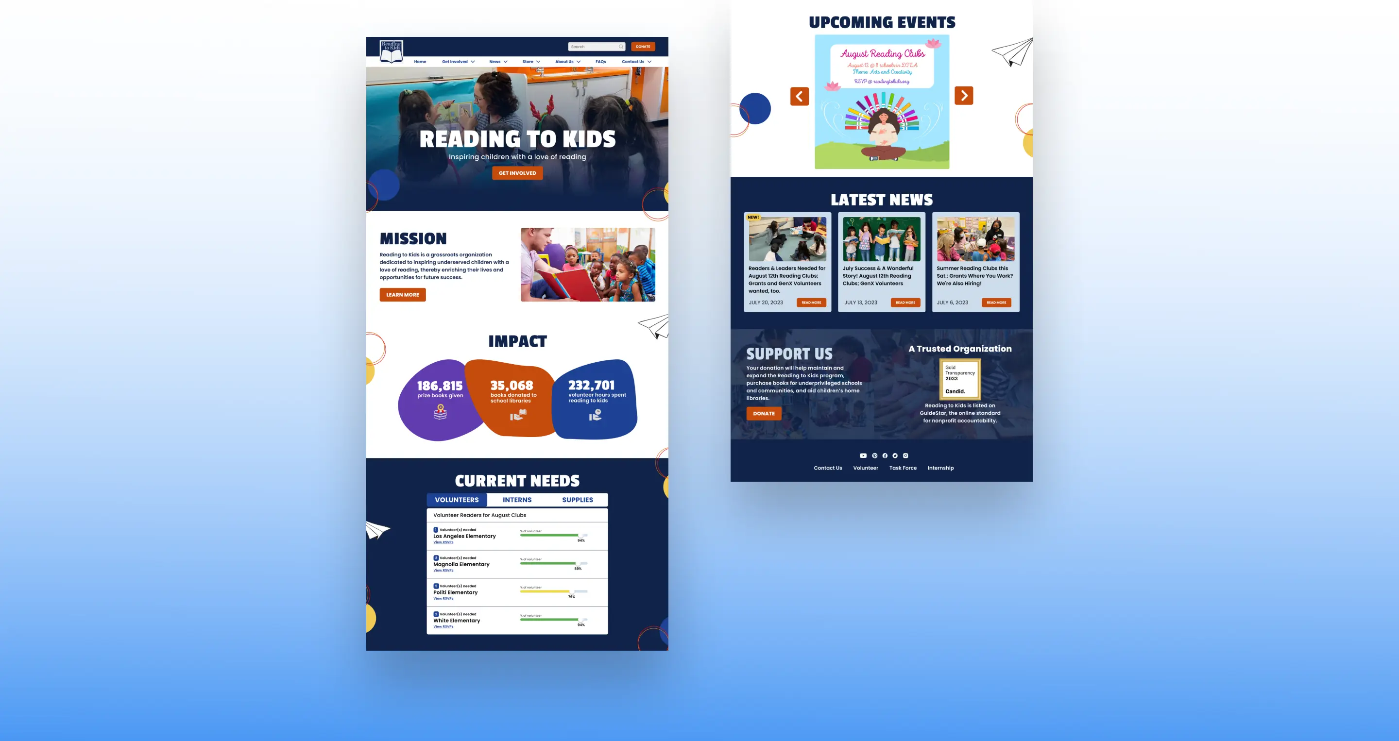
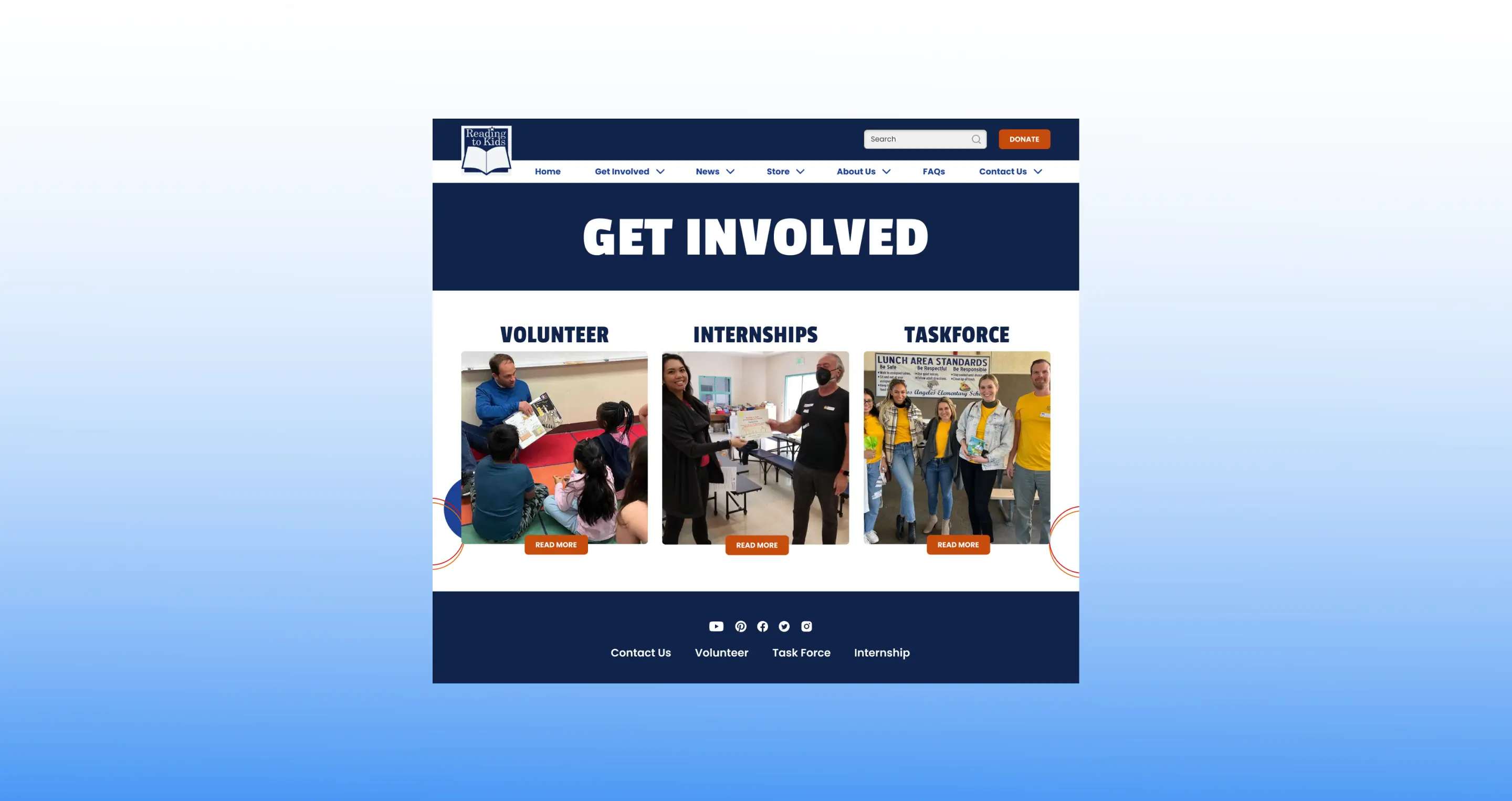
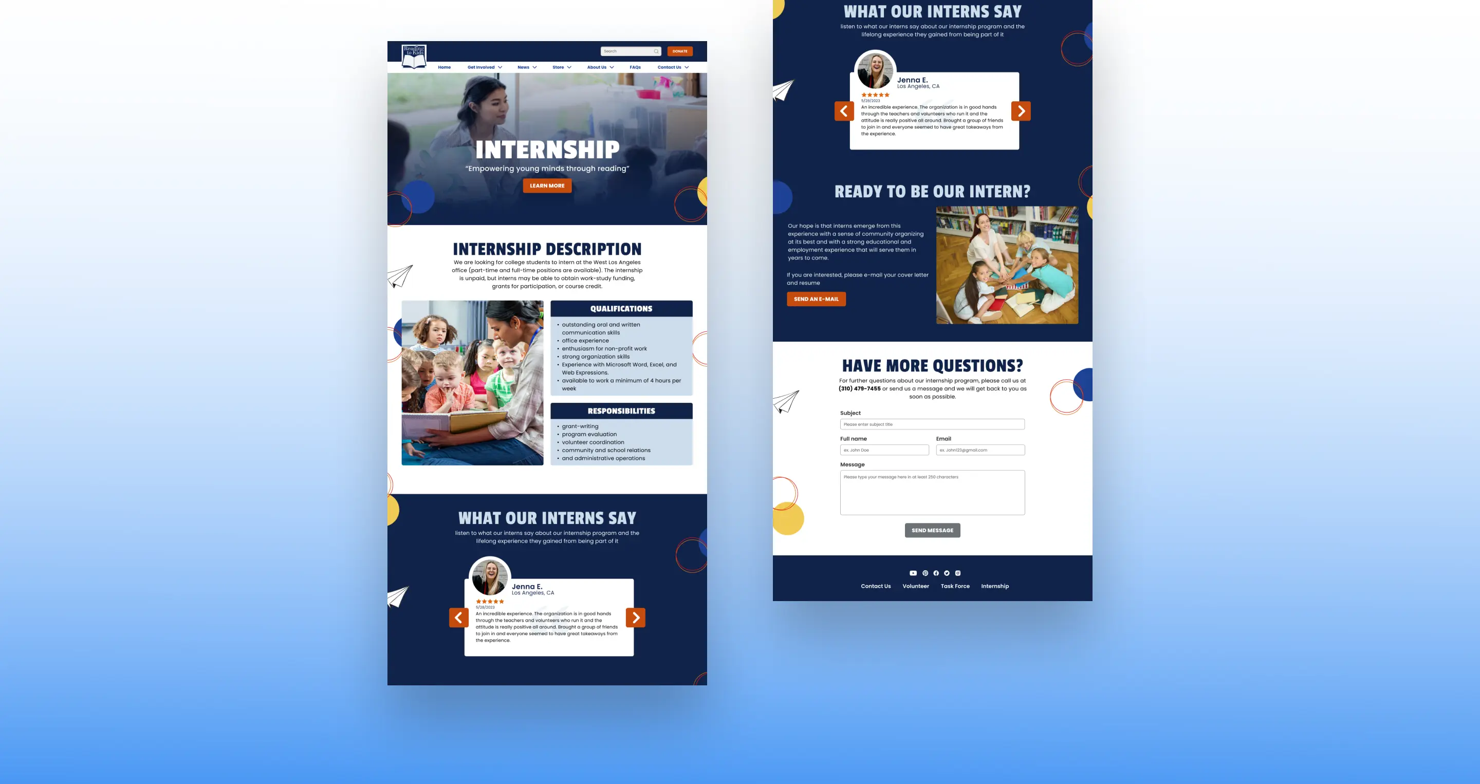
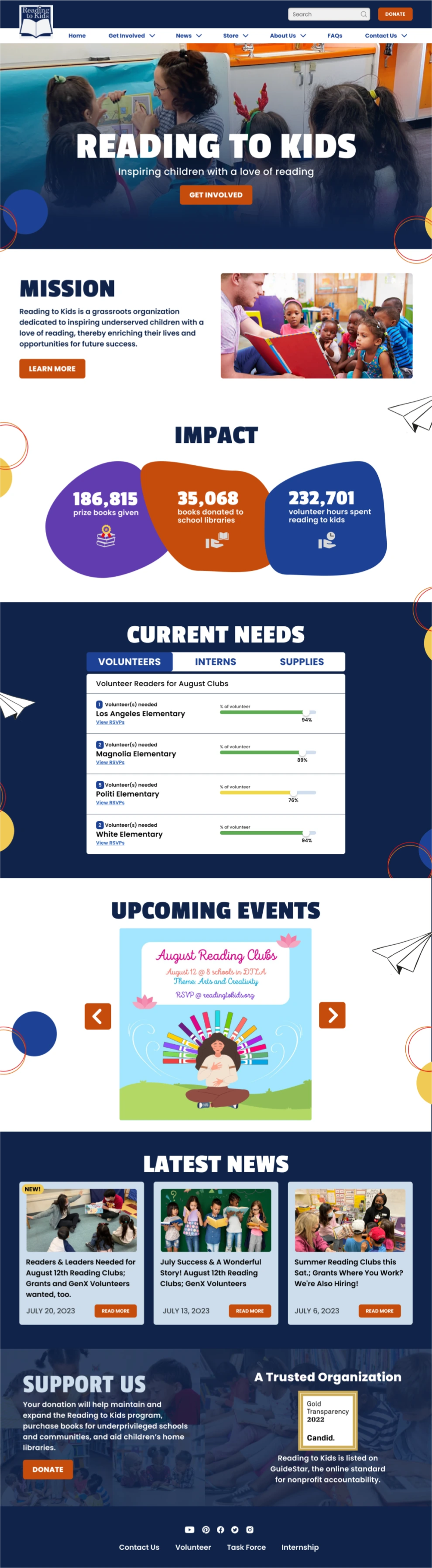
Solution
To solve the problem, we focused on two main design solutions: revamping the information architecture and content organization.
Design Solution Breakdown:
1
Simplified Navigation
• Horizontal top bar menu for immediate visibility
• Dropdown on hover menu reduces number of clicks
2
Less text; more visuals
• Less text can help users find and digest information quickly
• Visual graphics improves scanability of the website
3
Organized content in distinct section
Users can focus on one topic at a time reducing cognitive load and easier absorption of information
4
Prominent search bar & CTA buttons
• Moving the search bar on top to increase visibility
• CTA buttons will encourage users to take desired actions
5
Added a footer
Minimalist footer with only key links to not overwhelm users and for easier navigation.
Clickable Prototype
Click around the website below ↓
Mobile Prototype
Desktop Prototype
A Modern Yet Familiar Style
We aim for a modern yet familiar style that strikes a balance between professionalism and creativity.
What I've Learned
This project was both fun and challenging, and I’m grateful for the opportunity to collaborate with other designers. Here are some of the things I’ve learned:
Prioritize Early Accessibility Checks
I've learned that it's crucial to examine contrast and accessibility right from the start, as I had to make significant changes later due to contrast issues, which was time-consuming and required altering all assets to follow WCAG standards.
Communicate Design Decisions Effectively
Working with various designers entails differing design preferences. So, I learned how to articulate and explain my design choices better to gain trust from the team, because not everyone will always agree on the same thing.
Importance of Clear Design Guideline
While working on webpages with another designer, we noticed inconsistencies between them. This taught me that having clear design rules and working together is crucial to keep the design consistent across all pages.